
4 page magazine spread


My first time working with Indesign. I had a lot of trouble with this at first, but as I got to use it more, I slowly got the hang of it. Specifically moving and aligning the text so that it all fit in the proper space was challenging. Also the process of adjusting the image sizes where I had to adjust the border of the image and then the image itself was a little confusing. BUT, I figured it all out and I’m happy with how it came out!
Final Illustrator Project


My Illustrator final. Enjoyed using the pen tool the most, so I decided to trace three characters to put on the three cards. I wanted to do another minimalist thing like Bart, but I thought that might be too much of the same, so instead I decided to color them with a 4 color pastel palette. For the border, I tried to do a film strip, due to the fact that they’re animated characters.
Ai to PS Exported example
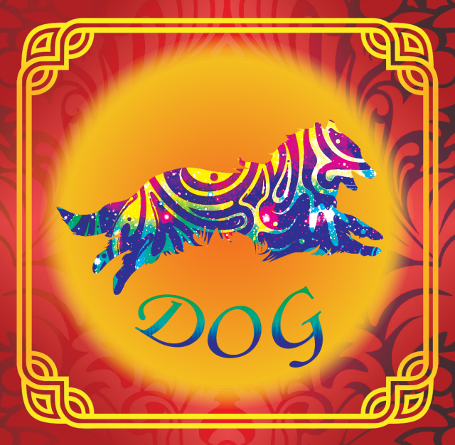
Started with the gold border and making the background red, but I thought it needed more. Then I decided to grab random patterns and designs from the internet and applying them to both the dog and the background. The dog I think looks really great. I gave it a sort of stripey pattern and added a layer of outer space behind that, giving a sort of paint splotch look to it.
Color Wheel
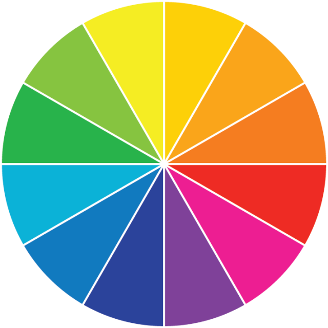
The basic color wheel. I didn’t know anything about that rotation tool before this, which seems extremely useful for copying lines at specific angles.
Independent Tutorial
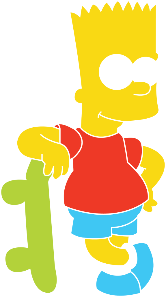
The tutorial I decided to do was a simple tracing of Bart Simpson with the pen tool. While making it, I accidentally made the outlines white, and that gave me the idea to change it into a minimalist sort of thing. Solid shapes with no major details, but you can still tell what the image is.
Pencil Illustrator

The first illustrator assignment we had. I was already familiar with the pen tool, but everything else used to make the correct shapes for this pencil were new to me. I think it came out looking very good for a first attempt at using these tools.
Final Photoshop Project
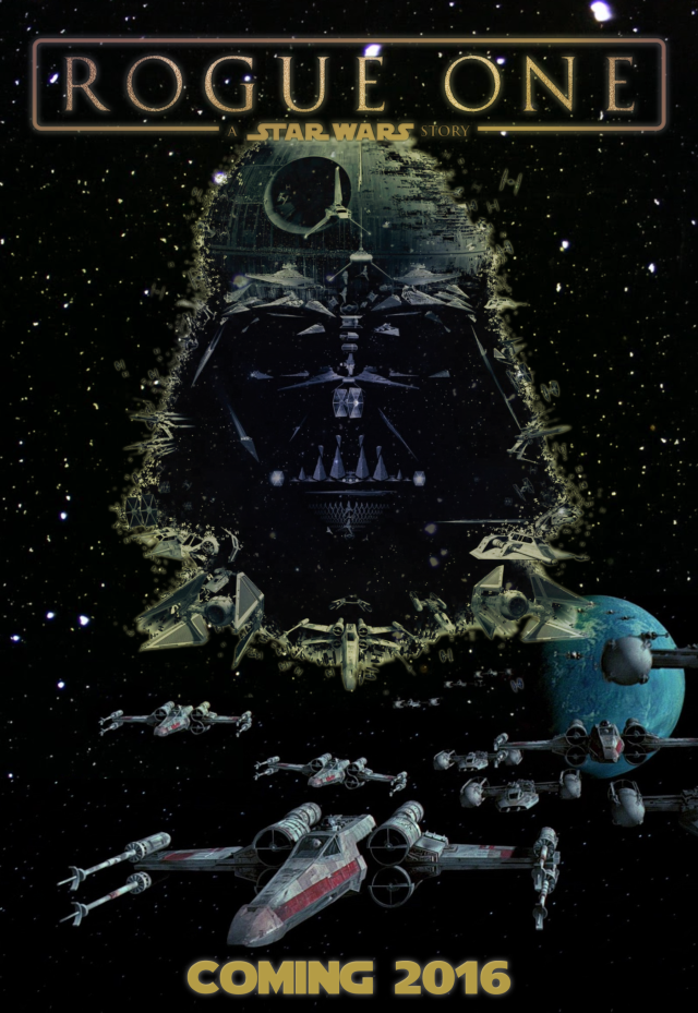
Tried to combine the things I learned about layer masks and selections into a movie poster. The poster uses three different images, and I added the text at the bottom. Something I figured out on my own while making this is that you could apply a gradient to a layer mask to achieve that cool-looking color effect the image has.
Retouching
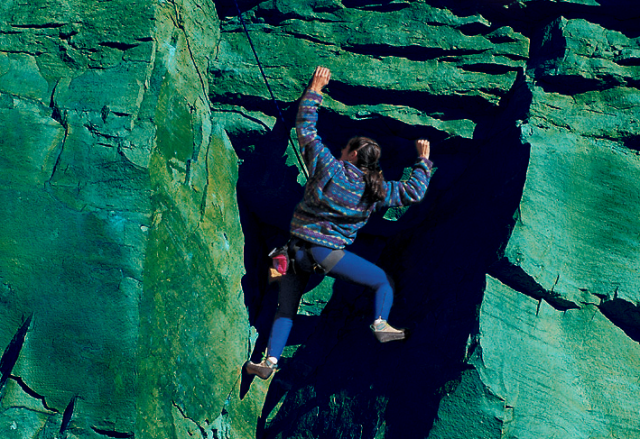
Turned the rocks blue and got rid of any extra markings on the face of the rock. It took a little time to make sure I selected everything except the girl, but I think it looks convincing!
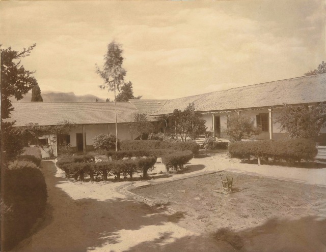
Took the ripped up photo from the files, and mainly used the healing brushes to make it appear whole. I think some spots are a bit noticeable, but otherwise looks good!
This one involved straightening the image and adding more color to it. I had no issues with the saturation, but my older version of photoshop caused tilting it to add jagged edges to everything. If that didn’t happen, I think it would look nice.
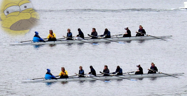
I copied the boat here and touched up the water around it so it would look like there are two groups of the same people. Then I, uh, added that face up there. I was messing more with layer masks, and it didn’t get nin the way of the image, so I left it in.
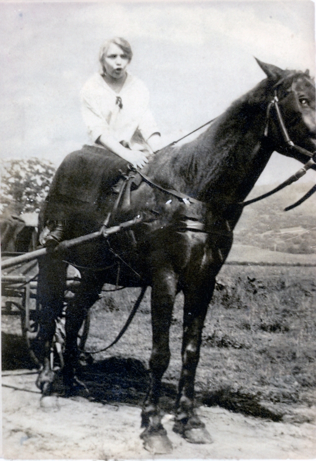
This is another photo that originally had a big rip in the middle. I made it as saturated as I could and fixed the rip. I think it looks nice at a glance, but I feel something about the horse looks a little off.
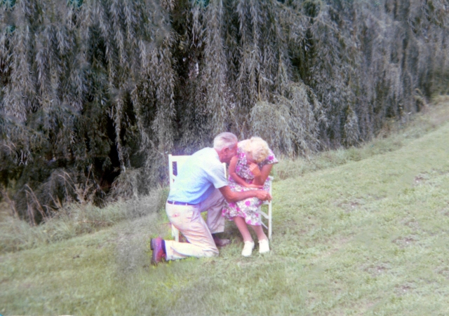
This one had some rips in it and practically no color at all. I fixed the rips and tried to add the color back, but in doing so I gave the old couple a weird glow?? It looks cool, but if they glow like that in real life I’m worried for them.
